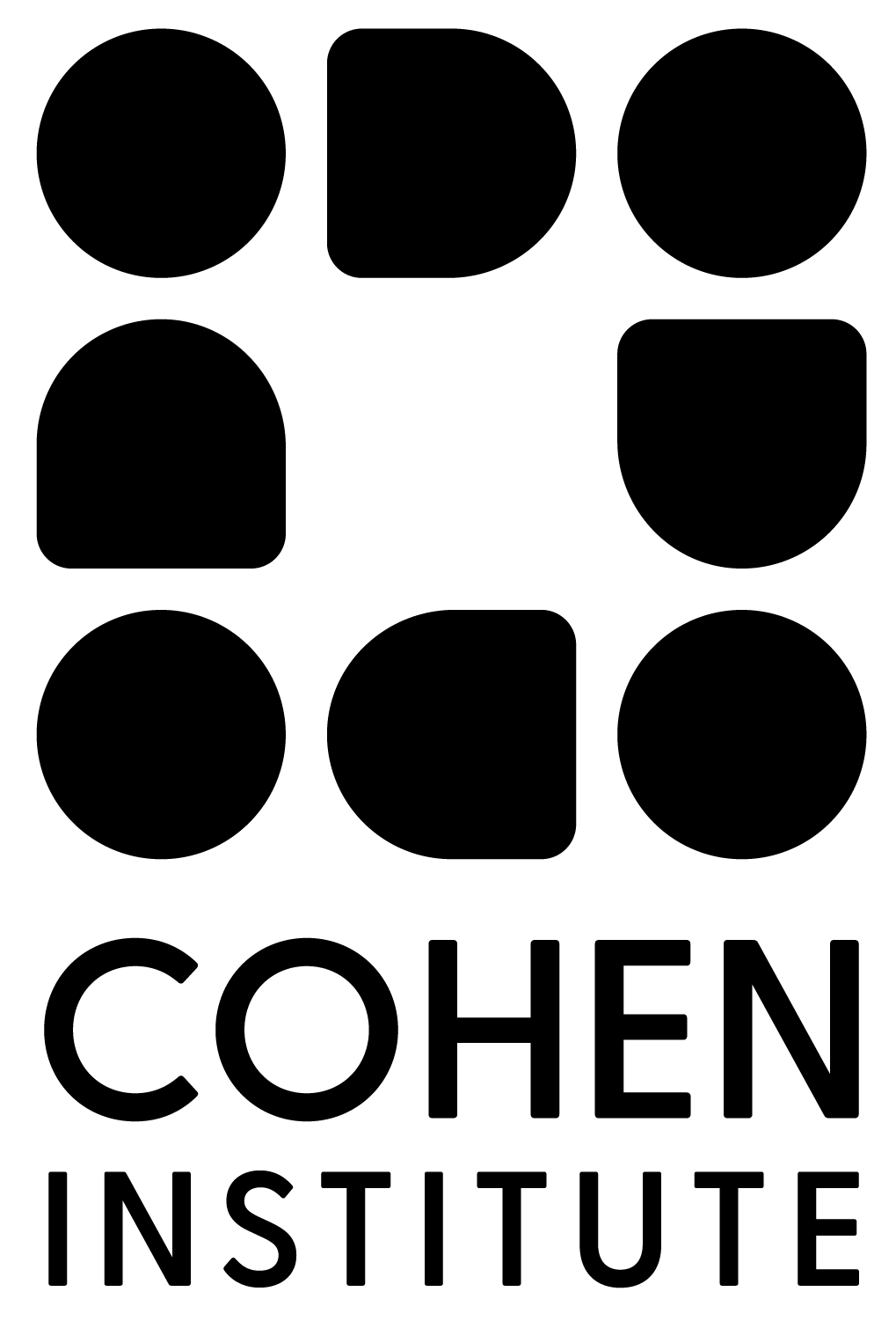
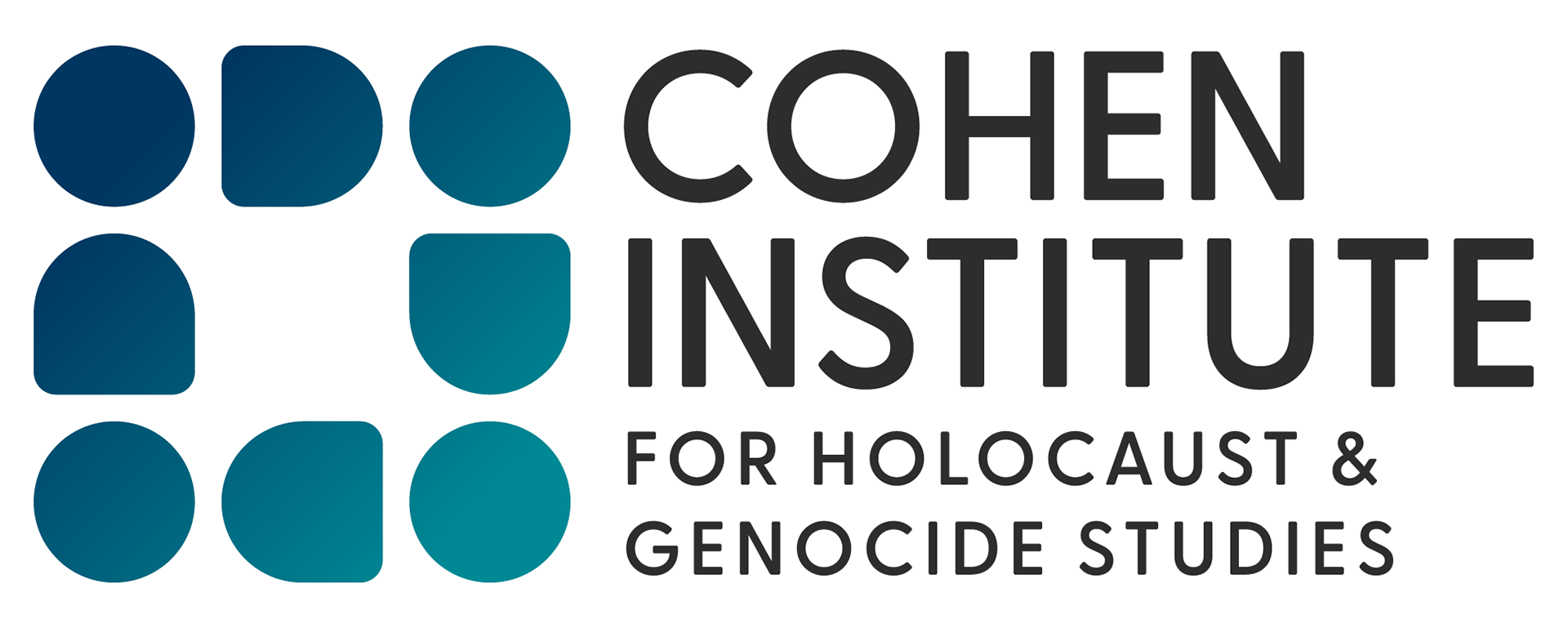
PROCESS SKETCHES
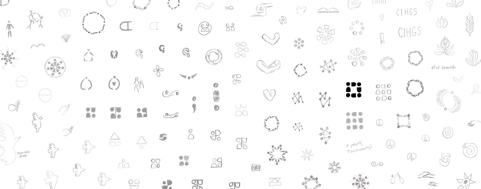
The Cohen Institute wanted to move away from the harsh barbed wire imagery of their previous logo and create a modern, impactful mark to speak to a broader audience. The new mark is built from abstracted, interconnected human forms that reflect the importance of connection and support in unprecedented times. Its stable, grid-like structure conveys strength, while rounded shapes and corners maintain a sense of friendliness and approachability.